THE MATTESONS STUDIO
logo design
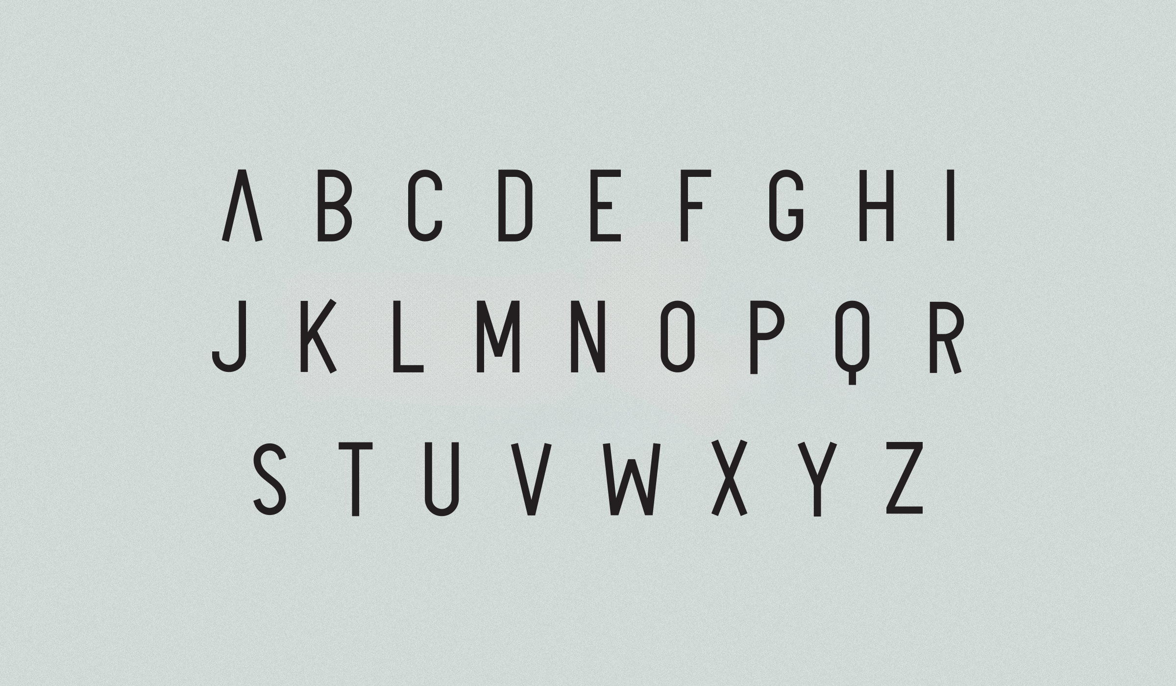
visual brand design
print design
Joe Matteson Photography has evolved into The Mattesons to redefine the vision and brand of this husband and wife photography team. The brand stands for unity, inclusivity, and creativity. From the custom lettering to the two shapes that make up a single unified monogram, the visual identity reflects the style and sophistication of their work. They always make it look so easy. And they always make it look so damn good.


testimonial
I've always looked up to Aaron's commitment to his work and clear vision of where a brand should go. We're crazy about our logo. There's no better feeling than when your branding makes a lasting impression.
Joe Matteson
Co-owner / Photographer
The Mattesons
credit
Joe Matteson, photo