MAGGIE ANN SOAP COMPANY
Art Direction
Packaging Design
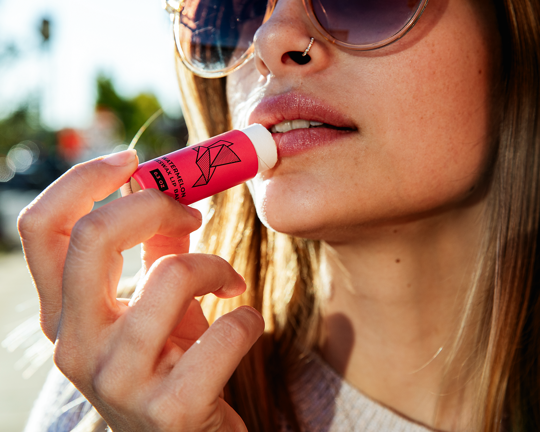
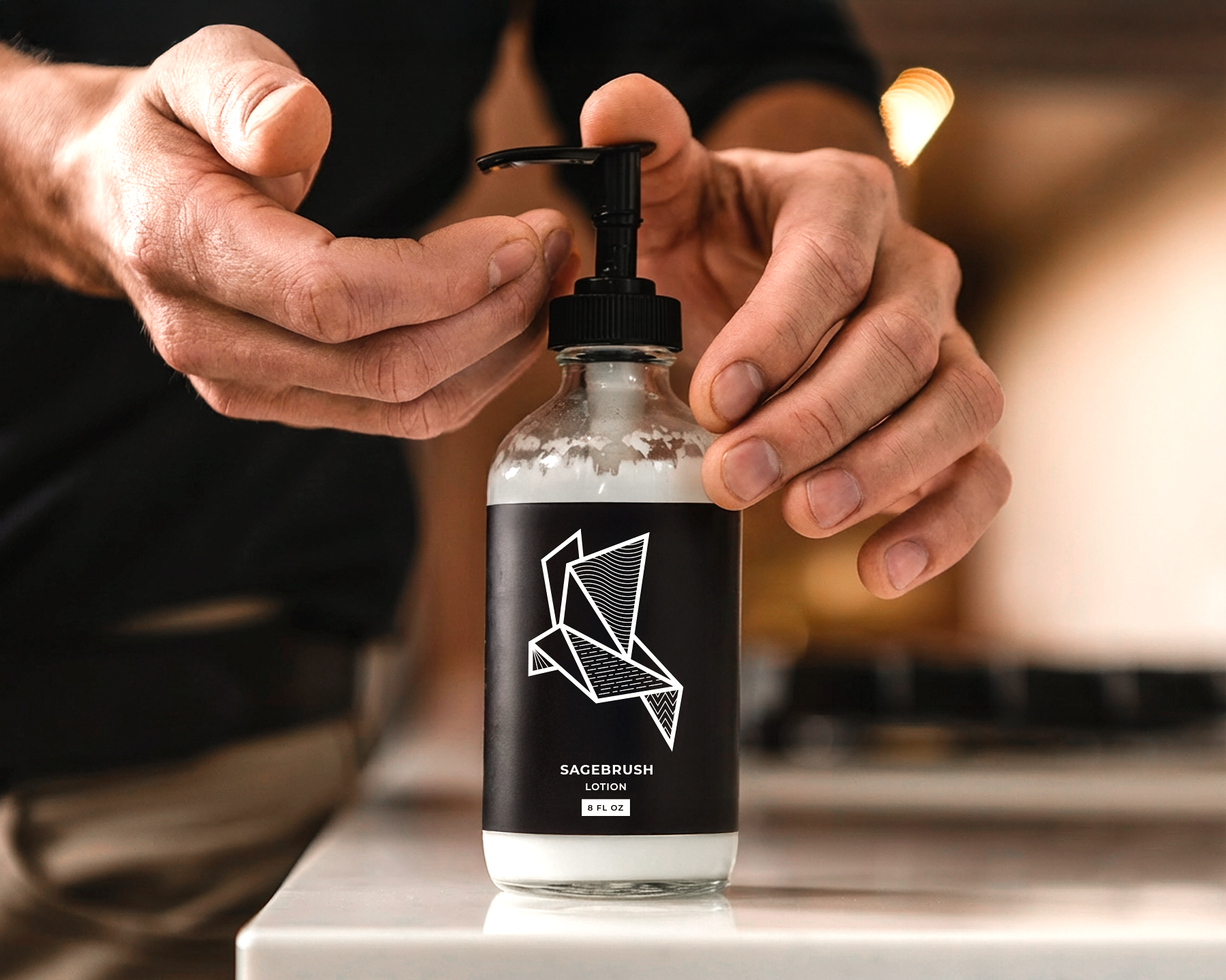
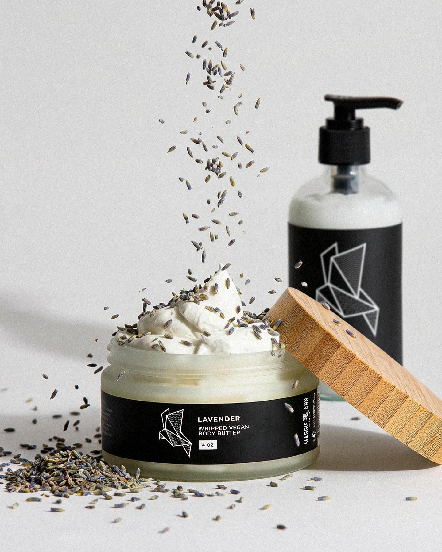
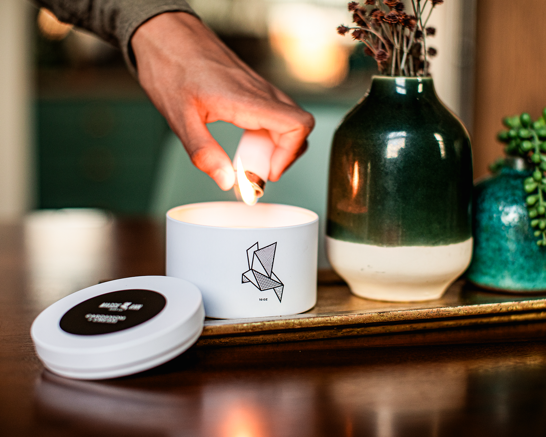
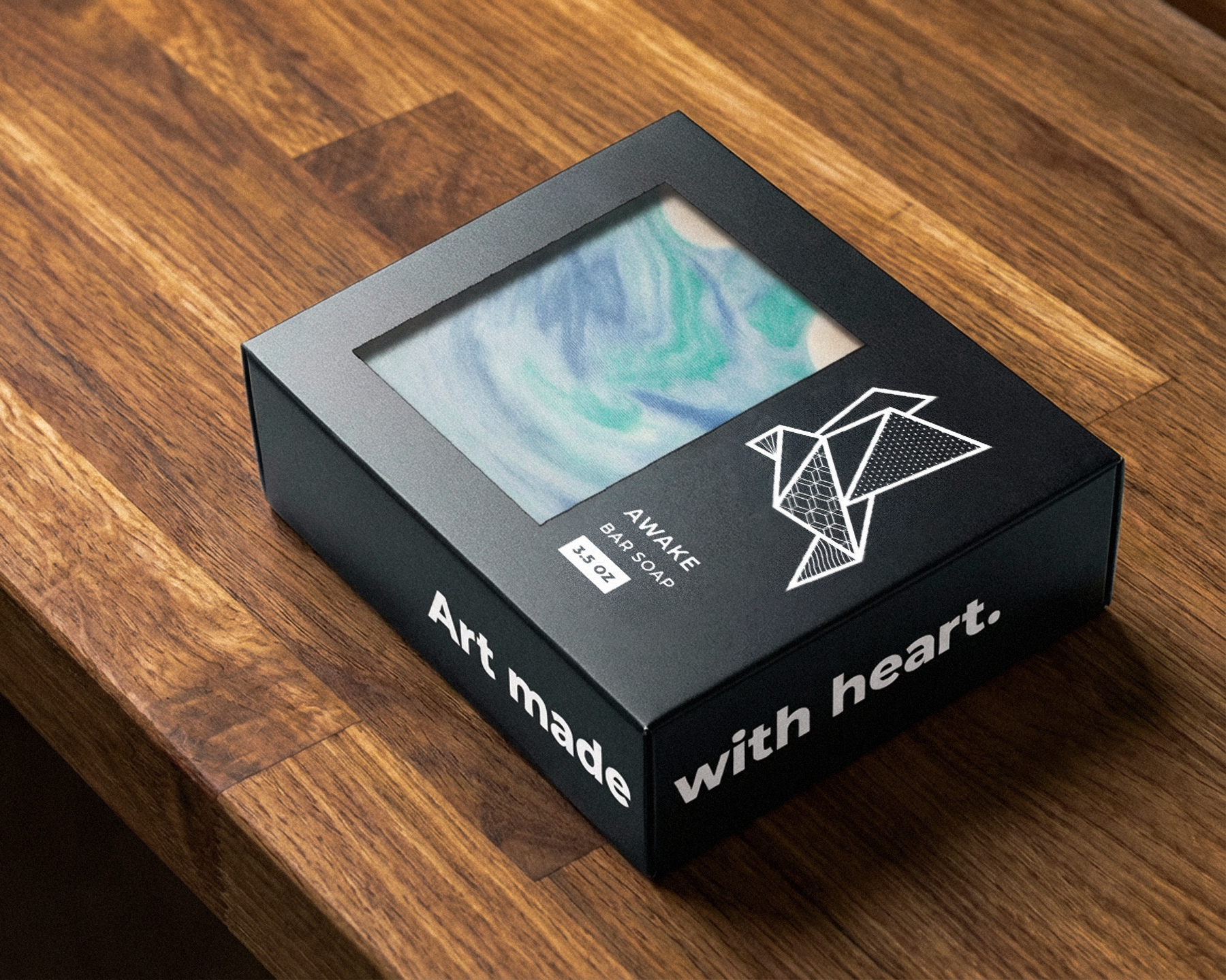
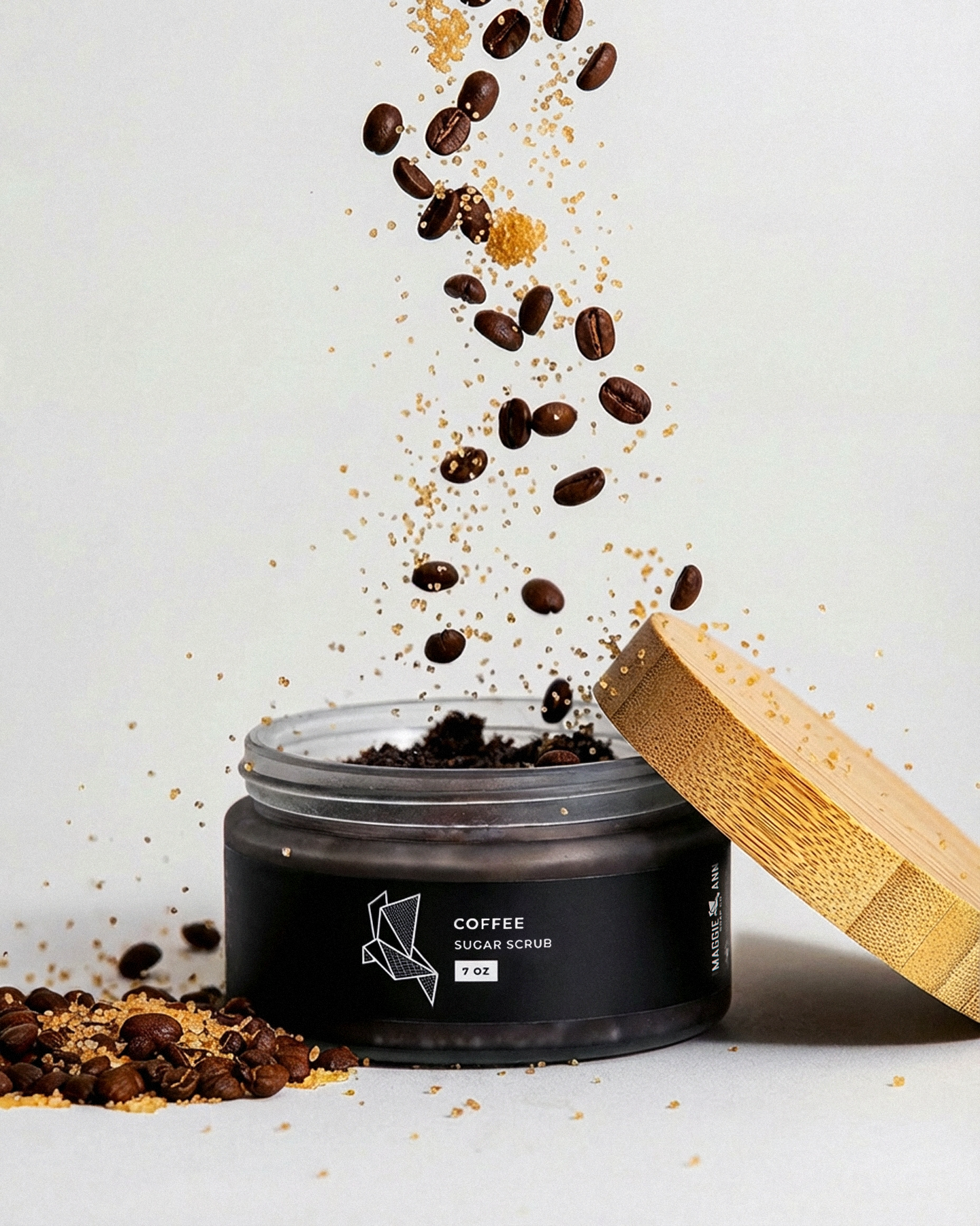
Maggie Ann Soap Co.’s products were starting to feel a little stale on the shelf and, frankly, cheap. It didn’t reflect the quality and beauty of the skincare products behind the labels. So the goal was to elevate the packaging without sanding off the warmth and personality people already connected with, while introducing a sharper edge. A refined packaging system brought clarity and consistency across the product line, allowing each item to feel considered without losing its handmade roots. Updated materials and eco-conscious production choices helped bring everything together. As the product line continues to grow, the packaging system grows with it.
WORDS
Aaron's work is top-notch and he's so easy to work with. I'm so happy with my brand updates and packaging design. I'd recommend him to anyone.
MAGGIE MCGUINNESS
Owner
Maggie Ann Soap Co.
CREDIT
Joe Matteson, Photo
